
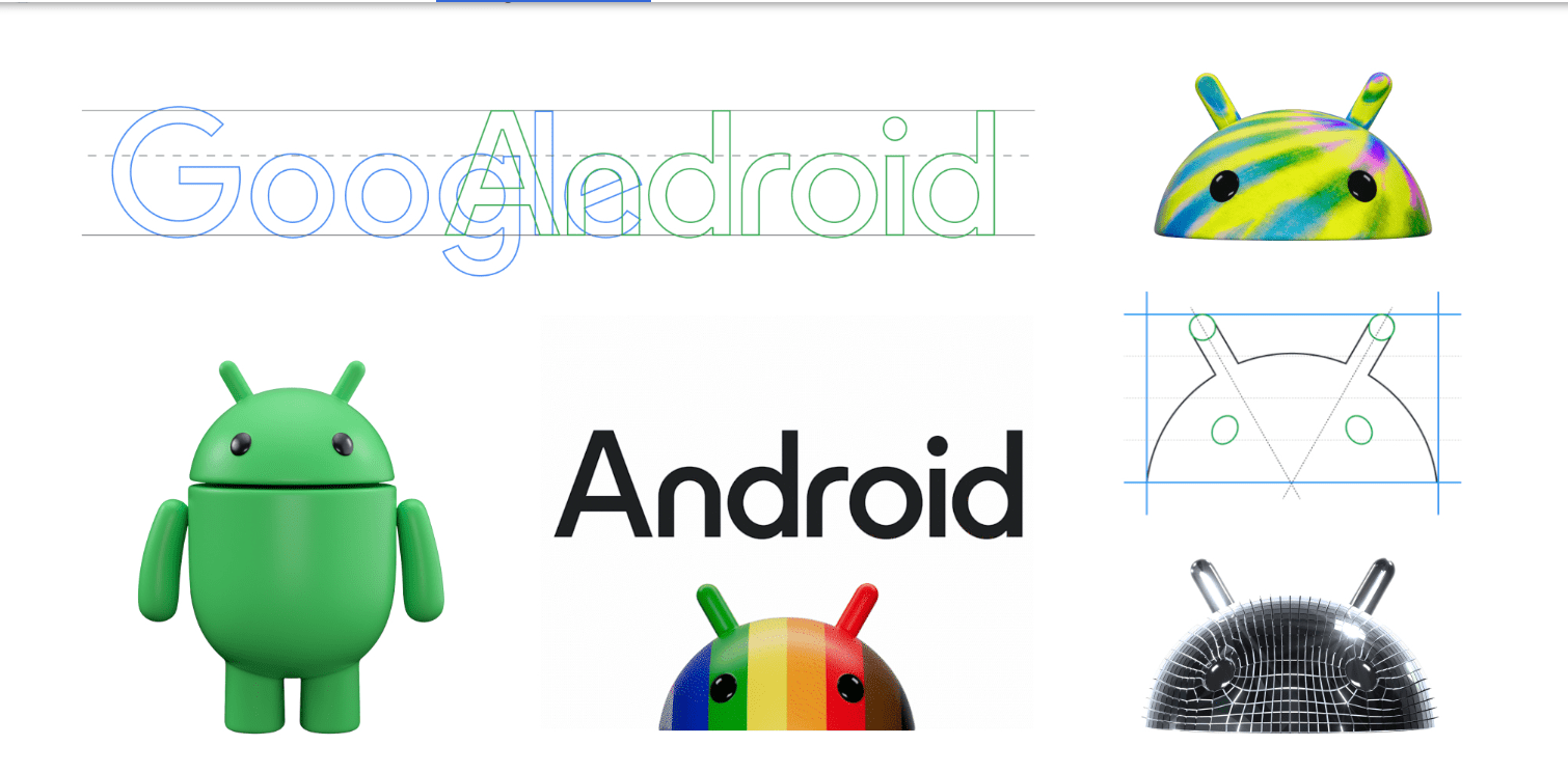
Google has just revealed a fresh, modern appearance for the Android brand. The revamped logo showcases a capitalized “A” that aligns more closely with Google’s logo, creating harmony between the two. This new logo also boasts more curves and personality, capturing Android’s playful and expressive spirit.
In addition to the logo, Google is introducing a vibrant new color scheme for Android. This palette features a range of lively and dynamic colors carefully chosen to be more inclusive and accessible. These colors also represent the diverse Android community.
With this updated Android look, Google aims to make the platform more contemporary and user-friendly. The revamped logo and color palette enhance Android’s visual appeal and usability.
These changes to the Android brand include:
- The “android” logo is now in uppercase, providing a more balanced appearance alongside Google’s logo.
- The logo incorporates more curves and personality, capturing the lively and expressive essence of Android.
- An updated color palette featuring various vibrant colors that are more inclusive and accessible.
Google emphasizes that this new Android look is part of its ongoing commitment to modernize and enhance the platform’s accessibility. The updated logo and color palette aims to make Android visually engaging and user-friendly for everyone.
Users can expect to see the new Android look on their devices in the coming weeks.
Source: Google Blog


