The other day, I heard a story about the Apple logo, which got me curious about the history of the Microsoft logo. So, let’s dive into the Microsoft logo’s journey, from its origins to what it means today—just the facts, no myths or strange tales.
We might not fully understand every decision behind the logo designs, and it’s hard to picture Bill Gates as a rock music fan! We’ve only seen two of Microsoft’s logos so far.
Microsoft’s first logo was introduced in 1975, featuring a groovy, retro design typical of the era. The original logo was stylized with a funky font that hinted at the rock and roll culture of the time. It reflected the early tech world’s creative and somewhat rebellious spirit, although it’s hard to picture Bill Gates as a rock enthusiast!
The Microsoft logo, from its origins
First logo from 1975 to 1980

The first Microsoft logo, introduced in 1975, was created by Bill Gates and Paul Allen. It featured a Sans Serif font, known for its clean and simple lines without decorative ends. The logo emphasized the company’s name by separating it into two parts, “Micro” and “Soft,” sometimes with a hyphen. The design, with its concentric lines, was influenced by the disco era, though some might argue it also had a modern flair.
This logo, eventually designed by Simon Daniel, had a short-lived presence at Microsoft, yet it remains one of the company’s most iconic symbols. The design was simple and hypnotic, and while it might seem easy to create in hindsight, it made a significant impact, giving the young company a distinct and memorable identity as it began its journey in Redmond.
Second logo from 1980 to 1982, the heavy metal era

On this occasion, the Redmond giant dispensed with the serif typography and opted for a custom font similar to New Zelek, which we can still find online. At Microsoft, they moved away from the bell-bottoms of the time groove from its first logo in a more metal style.
In this version, Microsoft moved away from the serif typography of its early logo and chose a custom font similar to New Zelek, which is still available online. The company shifted from its first logo’s groovy, disco-inspired look to a more metal, edgy style.
This redesign was significant, with the logo now featuring a single line and much sharper, more aggressive lettering, including pronounced angles and deep diagonals. The letters “M,” “R,” and “F” particularly stand out, drawing comparisons to the Metallica logo. Once again, Simon Daniel was behind this design.
If you’re designing a logo, it’s wise to aim for something timeless. Trends come and go quickly, and for a tech company, having a logo that ages well is crucial.
The third logo from 1982 to 1987, the steering wheel or CD-ROM

For the third logo, designer Simon Daniel aimed to make the distinctive “O” resemble a CD-ROM emerging in 1985. However, people often saw it as a steering wheel or a sunrise instead. This shows how creative intentions can be interpreted in many ways, with people often seeing what they want in a design.
The fourth logo from 1987 to 2012, the Pac-Man logo

In 1987, after the third logo by Simon Daniel, Microsoft introduced a new design by Scott Baker. This logo was notably simple, featuring a modified Helvetica Black Italic font version. Many of us have grown up with this logo, and it’s easily recognizable and versatile in any context. It was simple, elegant, and instantly identifiable.
Baker added a small notch to the first “O” to subtly reference the company’s origins, where “Micro” and “Soft” were separated. However, this design became affectionately known to many employees as the “Pac-Man logo,” a playful nod to the iconic game.
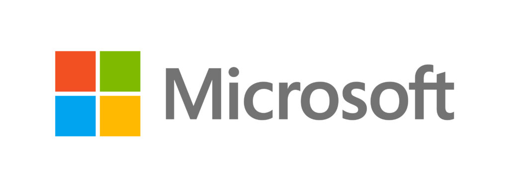
From 2012 to now, the latest logo is an apparent reference to Windows.

In the modern era, Microsoft moved away from monochrome logos and added a splash of color, introducing a square divided into four colors as its brand symbol. This design references Windows and represents the various areas of the company. Interestingly, the accompanying text is in a grey sans-serif font, which is simple and understated. The focus is on the four colored squares prominently featured on Surface devices and other hardware.
Using these four primary colors gives the marketing team the flexibility to create diverse branding strategies. This logo has become highly recognizable and has outshined its predecessors in style and popularity. It will be interesting to see if a new logo emerges soon, giving us more to discuss regarding design and significance.


