We’ve often discussed the pros and cons of Microsoft Edge and one of the most frequent complaints from users is the cluttered settings area, which makes it difficult to navigate and use effectively daily. However, it appears that Microsoft is finally addressing this issue and is determined to improve.
Microsoft wants to organize Edge settings.
Microsoft is actively working to address the long-standing issues with the settings interface in Microsoft Edge, aiming to make the browser more user-friendly. They’re reorganizing the settings menu to improve navigation and usability, a common complaint for many users.
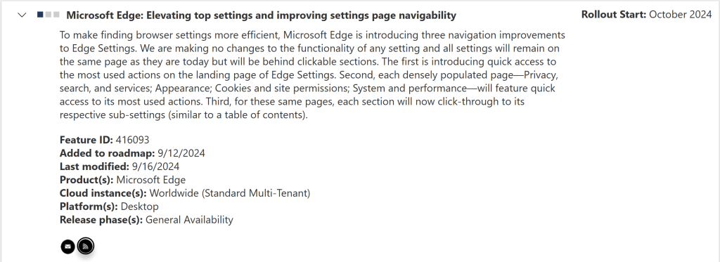
Interestingly, this update isn’t found in the usual Edge documentation but appears in the Microsoft 365 roadmap under the title “Microsoft Edge: Improving top settings and improving the navigability of the settings page.” The goal is to streamline the experience and provide quicker access to frequently used options.

One of the key changes is the introduction of a new quick actions panel in the Edge settings. Additionally, users who access submenus like System and Performance or Appearance will now have one-click shortcuts for the most commonly used options.
To further enhance usability, Microsoft plans to break down the extensive lists of settings into smaller, more manageable subsections, similar to a book index, making it easier to find specific settings.
While this overhaul promises to improve user experience, there is hope that the new quick actions menu’s design will avoid further confusion. Microsoft Edge initially stood out as a solid browser. Still, with a growing number of features and add-ons, many feel it’s time to refocus on what matters most—streamlined navigation and core functionality. The redesigned settings page is expected to roll out in October, and users can look for changes in the Canary channel leading up to the official release.


